The most beautiful mockup in the world is worthless if the developer builds something different, the client never saw the mobile version, and the copywriter's revisions arrived by email three days after the design was approved. Web design fails far more often from broken collaboration than from weak visual skills — which is why the tools a team collaborates in matter just as much as the tools it draws in.
Our design team has spent years refining a collaborative toolkit across hundreds of client projects, and this article shares what actually survived that testing. We will cover the design platforms themselves, the feedback and annotation layers around them, developer handoff workflows, and the habits that make these tools effective rather than just another place where comments go to die.
Table of Contents
- Why collaboration is the real bottleneck in web design
- Figma: still the collaborative standard
- Penpot and the open-source alternative
- Whiteboarding and early-stage ideation tools
- Feedback and approval workflows with clients
- Designer-to-developer handoff that actually works
- Frequently asked questions
- Final thoughts
Why Collaboration Is the Real Bottleneck in Web Design
Think about where web projects actually stall. It is rarely the pixels. It is the week lost waiting for stakeholder sign-off, the rework caused by feedback delivered against an outdated version, or the developer questions that pile up because the design file does not explain what happens on hover, on error, or at 375 pixels wide. Every one of those failures is a collaboration failure.
Good collaborative tooling attacks these problems directly: a single source of truth everyone views live, comments anchored to the exact element under discussion, version history that makes "which file is final?" an obsolete question, and inspectable designs that answer developer questions without a meeting. Teams that get this right ship faster and argue less — and the difference compounds on every project.
The tools below are organized by the stage of work they serve, because the biggest mistake teams make is forcing one tool to do everything. Ideation, high-fidelity design, client review, and handoff each have different needs.
Figma: Still the Collaborative Standard
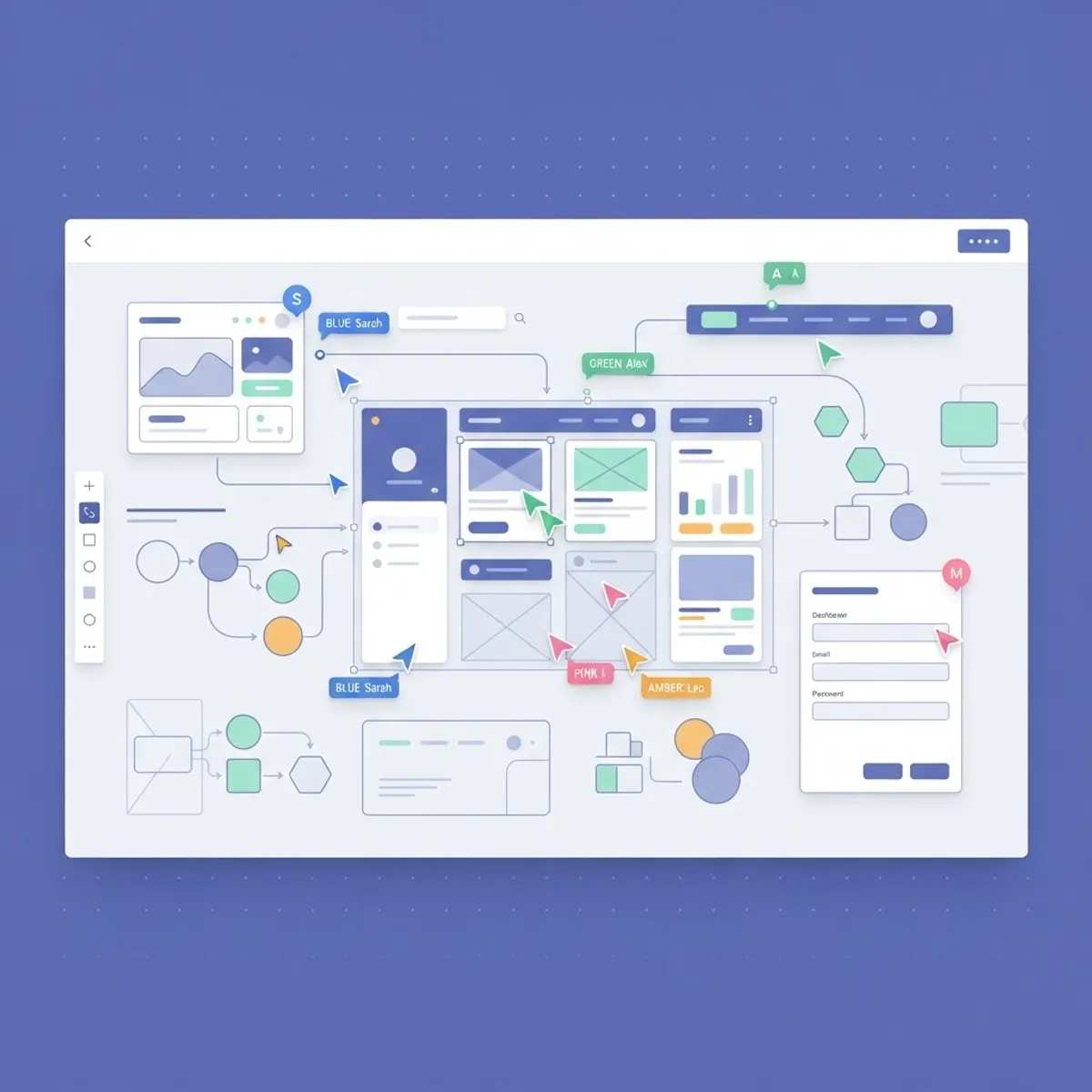
Figma earned its dominance by treating multiplayer editing as the foundation rather than a feature, and in 2026 it remains the center of gravity for collaborative web design. Multiple designers work in the same file simultaneously, stakeholders follow along in observation mode, and every comment lives directly on the canvas next to the element it describes. Branching and merging bring code-style review workflows to design files, which matters enormously once a design system is involved.
The features that pay off most in client work are often the quiet ones. Shared component libraries keep a fifty-page site visually consistent across three designers. Variables and modes let a team maintain light and dark themes — or an entire multi-brand system — from one set of components. Dev Mode gives engineers measurements, tokens, and code snippets without exporting a single asset. For agencies delivering full website design engagements, these capabilities directly reduce revision cycles and budget overruns.
Figma's weaknesses are worth naming honestly. Costs climb as teams grow, since full editing seats are priced per editor. Very large files with heavy component usage can slow down on modest hardware. And its very flexibility means an undisciplined team can create chaos at scale — a shared library with no governance is just shared clutter. The tool rewards teams that invest in structure.
Penpot and the Open-Source Alternative
Penpot has grown from a curiosity into a genuinely viable Figma alternative, and it brings two arguments that resonate with specific teams. First, it is open source and self-hostable, which matters to organizations with strict data residency or procurement requirements. Second, its design primitives are built on web standards — SVG and CSS — so what you design maps more directly to what developers build.
That second point deserves emphasis. Penpot's layout tools mirror CSS flexbox and grid behavior, which means a designer's auto-layout decisions translate to the developer's implementation with far less interpretation. Teams doing tightly coupled front-end web development alongside design report noticeably fewer "the build doesn't match the mockup" conversations.
The trade-offs: Penpot's ecosystem of plugins, templates, and community resources is thinner than Figma's, and enterprise features arrive more slowly. But for budget-conscious teams, privacy-sensitive organizations, or design groups that sit very close to engineering, it is worth a serious pilot.
Whiteboarding and Early-Stage Ideation Tools
High-fidelity design tools are the wrong place to start a project. Early-stage thinking — sitemaps, user flows, content priorities, rough layout sketches — moves faster on an infinite canvas where nobody worries about spacing tokens. FigJam and Miro dominate this space, and both are excellent; FigJam wins for teams already living in Figma, while Miro's deeper facilitation features suit larger workshops with mixed stakeholders.
The underrated practice here is running structured client workshops before any design begins. A one-hour collaborative session mapping the site structure with sticky notes surfaces disagreements between stakeholders while they are still cheap to resolve. It also creates shared ownership: clients who helped shape the sitemap defend it later, rather than requesting a restructure at the mockup stage.
Visual thinking also extends past the ideation phase. Turning complex service explanations or data-heavy content into diagrams and visual assets often becomes part of the deliverable itself — teams frequently pair this stage with professional infographic design to transform workshop outputs into publishable content.
Feedback and Approval Workflows With Clients
Client feedback is where collaboration most often breaks down, because clients do not live in design tools. Sending a Figma link to a non-designer frequently produces silence, or worse, a phone call describing a problem "somewhere on the second page." The fix is meeting clients where they are: shareable prototypes with comment-only access, or dedicated review layers like Markup or annotation workflows built into project management tools.
A few habits make client review dramatically more productive. Present designs in context — a clickable prototype at realistic device sizes — rather than static exports that invite pixel-level nitpicking of unfinished states. Batch feedback into structured rounds with clear deadlines instead of accepting a continuous drip of comments. And record a short walkthrough video for every major review; a five-minute narrated tour prevents most misreadings of design intent before they happen.
For ongoing engagements — landing page programs, campaign creative, recurring social media and banner design — it pays to formalize the approval pipeline: draft, internal review, client review, approved. Every asset lives in exactly one state, and nothing ships from any state except approved. Simple, boring, and it eliminates an entire category of mistakes.
Designer-to-Developer Handoff That Actually Works
Handoff is not a moment; it is a relationship. The teams that ship pixel-faithful builds are not the ones with the most detailed redline documents — they are the ones where developers were in the file weeks before handoff, flagging expensive ideas early and understanding intent rather than just measurements.
Tooling supports this in concrete ways. Figma's Dev Mode exposes spacing, typography, and design tokens directly; when those tokens are named to match the code's design system, translation friction nearly disappears. Component-based design that mirrors the component structure of the build — a card component in Figma corresponding to a card component in React — turns handoff into mapping rather than interpretation. Teams building on modern stacks through React JS web development benefit most from this one-to-one component discipline.
Two practices close the loop. First, document behavior, not just appearance: hover states, empty states, error states, loading states, and breakpoint transitions belong in the file. Second, run design QA on the staging build with the original designer present. A thirty-minute review catches the dozen small drifts — a wrong gray, a cramped margin — that would otherwise ship and quietly erode the design's quality.
Frequently Asked Questions
1. What is the best collaborative design tool for web design in 2026? Figma remains the strongest all-around choice thanks to real-time multiplayer editing, robust component systems, and Dev Mode for handoff. Penpot is the leading open-source alternative, particularly for teams that want self-hosting or tighter alignment with CSS-based layouts.
2. Is Figma still free for small teams? Figma offers a free tier suitable for individuals and very small projects, with limits on files and version history. Growing teams typically need paid editor seats. Viewers — clients, developers, stakeholders — can comment and inspect on most plans without a paid seat, which keeps review costs manageable.
3. How do I collect design feedback from clients who don't use design tools? Share comment-enabled prototype links rather than editable files, pair each review round with a short recorded walkthrough, and set explicit feedback deadlines. Many teams also consolidate feedback through their project management tool so clients never have to learn new software.
4. What should a design handoff to developers include? Component specs with spacing and typography, design tokens matching the code's naming, all interactive states (hover, focus, error, loading, empty), responsive behavior at agreed breakpoints, and exported assets. Just as important: a live conversation, since documents never capture full intent.
5. Can whiteboard tools like FigJam replace proper wireframing? For early structure and flow decisions, yes — low-fidelity sketches on a shared canvas are faster and invite broader participation. Once layout precision starts to matter, move to a proper design tool. The mistake is skipping the whiteboard stage entirely and debating structure inside polished mockups.
6. How do design systems improve collaboration? A shared component library gives every designer the same building blocks, keeps multi-page sites consistent, and gives developers a stable contract to build against. Changes propagate from one source, so a button update flows through every screen instead of requiring manual fixes across dozens of files.
7. Should developers have access to design files during the design phase? Absolutely. Early developer visibility catches technically expensive ideas while they are still cheap to change, and it builds the shared understanding that makes handoff smooth. The healthiest teams treat design files as a shared workspace, not a deliverable thrown over a wall.
Final Thoughts
Collaborative design tools have quietly become the operating system of modern web design. Figma sets the standard, Penpot offers a credible open alternative, whiteboard tools own the early messy thinking, and structured feedback workflows keep clients engaged instead of confused. But the consistent lesson from real projects is that tools amplify habits — a disciplined team gets exponential value from them, while an undisciplined one just produces chaos in higher resolution.
If your team is fighting collaboration friction — endless revision rounds, builds that drift from designs, feedback scattered across five channels — the fix is usually process and tooling together, not another meeting. Our design and development teams work as one unit, from first whiteboard to final graphic design polish and production build. Get in touch and we will show you what a genuinely collaborative web design engagement looks like.