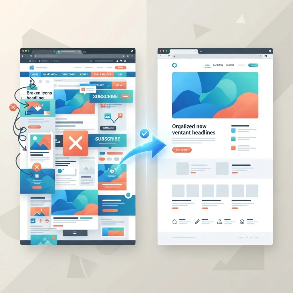
Most bad websites aren't ugly. They're subtly broken in ways the owner can't see because they visit their own site every day, know exactly where everything is, and never experience it the way a first-time visitor does. Meanwhile, real users hit a wall of small frustrations — a menu that hides the page they need, text they can't read on their phone, a form that asks for too much — and quietly leave.
Web design mistakes are expensive precisely because they're invisible to the people making them. This guide walks through the most common and costly errors we see across industries, explains why each one hurts, and gives you a concrete fix. Whether you're auditing an existing site or planning a new one, avoiding these traps will put you ahead of most competitors.
Table of Contents
- Why web design mistakes are so costly
- Slow load times and heavy pages
- Poor mobile experience
- Confusing navigation and structure
- Weak or missing calls-to-action
- Ignoring accessibility
- Cluttered layouts and poor readability
- Neglecting SEO fundamentals
- Frequently asked questions
- Final thoughts
Why Web Design Mistakes Are So Costly
A website is often the first real interaction someone has with your business. Within seconds, visitors form a judgment about whether you're credible, whether you understand their problem, and whether it's worth their time to stay. Design mistakes sabotage that judgment before you ever get a chance to make your case.
The cost isn't only lost visitors. Search engines increasingly reward sites that deliver a strong page experience and genuinely helpful content, so the same mistakes that frustrate users also drag down your rankings. That creates a compounding problem: fewer people find you, and the ones who do are more likely to leave.
The encouraging news is that most of these mistakes are fixable, often without a full redesign. Recognizing them is the first and most important step.
Slow Load Times and Heavy Pages
Speed is the mistake that hides in plain sight. Studies consistently show that conversion rates drop sharply for every extra second a page takes to load, and mobile users are especially unforgiving. Yet many sites ship enormous uncompressed images, bloated scripts, and unnecessary third-party tools that pile on delay.
Google's Core Web Vitals put hard numbers on this experience, measuring how quickly the main content loads and how stable the layout is as it renders. A site that fails these metrics feels sluggish and often ranks worse.
The fix is disciplined performance work: compress and correctly size images, lazy-load anything below the fold, minimize scripts, and choose a fast hosting and framework foundation. Modern stacks built with thoughtful front-end web development or frameworks like Next JS make fast-by-default sites far easier to achieve.
Poor Mobile Experience
The majority of web traffic now comes from mobile devices, and Google indexes the mobile version of your site first. Despite this, plenty of sites are still designed desktop-first and then awkwardly squeezed onto small screens, leaving tiny tap targets, horizontal scrolling, and text that requires pinching to read.
A poor mobile experience doesn't just annoy visitors — it actively pushes away the largest segment of your audience. Buttons that are hard to tap, pop-ups that cover the whole screen, and forms that are painful to complete on a phone all bleed conversions.
The solution is a genuinely mobile-first approach: design for the smallest screen first, then enhance for larger ones. Every reputable website design today should be fully responsive, with generous tap targets, readable type, and layouts that reflow cleanly across devices.
Confusing Navigation and Structure
If visitors can't find what they're looking for within a few seconds, they leave. Overloaded menus, vague labels like "Solutions" that mean nothing to outsiders, and inconsistent structures across pages all create friction that quietly kills engagement.
Good navigation is invisible because it just works. It uses plain, descriptive labels, groups related pages logically, and keeps the most important destinations one click away. A clear structure also helps search engines understand and index your content, which supports your rankings.
Fix confusing navigation by simplifying your menu to the handful of things visitors actually want, using language your customers use rather than internal jargon, and adding clear pathways — related links, breadcrumbs, and obvious next steps — throughout the site.
Weak or Missing Calls-to-Action
A surprising number of sites make it hard to take the next step. The call-to-action is buried, vague, or missing entirely, leaving interested visitors with nowhere obvious to go. Every page should answer the question, "What do you want me to do next?"
Weak CTAs often come from timidity — a fear of seeming pushy. But a clear, confident prompt actually helps visitors who are ready to act. "Get a free quote," "Book a consultation," or "Start your project" beats a lonely "Submit" button every time.
The fix is to make one primary action obvious on every important page, style it so it stands out, and reduce friction around it. If a form is the conversion point, ask only for what you truly need — every extra field costs you completions.
Ignoring Accessibility
Accessibility is frequently treated as optional, which is both a moral and a business mistake. Around one in five people lives with a disability, and an inaccessible site shuts them out entirely. It also exposes businesses to legal risk and signals carelessness to everyone.
Common accessibility failures include poor color contrast, images without alt text, forms without proper labels, and interfaces that can't be navigated by keyboard. Many of these issues also happen to hurt SEO and general usability, so fixing them benefits everyone.
Building to recognized standards like the Web Content Accessibility Guidelines (WCAG) ensures your site works for the widest possible audience. Accessibility should be baked into design and front-end web development from the start, not bolted on at the end.
Cluttered Layouts and Poor Readability
When everything is emphasized, nothing is. Cluttered pages packed with competing colors, dense blocks of text, and too many elements overwhelm visitors and hide your most important message. Whitespace isn't wasted space — it's what gives content room to breathe and be understood.
Readability problems compound the issue: tiny fonts, low contrast, long unbroken paragraphs, and cramped line spacing all make content feel like work. Since most visitors skim, hard-to-scan pages get abandoned quickly.
The fix is restraint and hierarchy. Use clear headings, short paragraphs, generous spacing, and a limited, consistent set of colors and fonts. Thoughtful graphic design and strong content writing work together here to make pages both attractive and easy to absorb.
Neglecting SEO Fundamentals
A beautiful website that no one can find is a private art gallery with the lights off. Many designs ignore SEO basics: missing or duplicate title tags and meta descriptions, poor heading structure, slow performance, and no plan for content that answers what people actually search for.
SEO isn't something you sprinkle on at the end. It's a design and structure consideration from day one — clean URLs, logical hierarchy, fast load times, and content organized around real search intent. When design and SEO are planned together, you get a site that looks great and gets discovered.
The fix is to treat search visibility as a core requirement, supported by ongoing digital marketing and content that continues to earn traffic long after launch.
A Quick Self-Audit Checklist
Before you assume your site is fine, run through a short, honest self-audit. These checks surface the most common mistakes in minutes and give you a clear list of what to fix first.
Open your site on your phone. Can you read everything without zooming? Are buttons easy to tap? Does anything overflow the screen or load slowly on mobile data? Most visitors experience your site this way, so problems here matter most.
Time the homepage load. If it takes more than a couple of seconds on a normal connection, oversized images or heavy scripts are likely dragging you down. Run it through a free speed test and note the Core Web Vitals scores.
Ask a stranger to complete a task. Give someone unfamiliar with your business a goal — 'find our pricing' or 'contact us' — and watch silently. Every hesitation reveals a navigation or clarity problem you've grown blind to.
Check for a clear next step on every page. If any important page leaves visitors with nowhere obvious to go, you're losing conversions. Add a relevant call-to-action.
Scan for broken links and outdated content. Nothing erodes trust faster than a dead link or a copyright date from three years ago. Regular website maintenance and support keeps these issues from piling up.
Work through this list quarterly and you'll catch most design mistakes long before they cost you customers.
Frequently Asked Questions
1. What is the single most common web design mistake? Poor mobile experience and slow load times are the most widespread, and they're closely linked. Since most traffic is mobile and Google indexes mobile-first, these errors affect nearly every visitor and often the rankings too.
2. How do I know if my website has design problems? Watch your analytics for high bounce rates, low time on page, and poor conversion rates, and run free tools like PageSpeed Insights. A professional audit will pinpoint issues you can't see as the site owner.
3. Can I fix these mistakes without a full redesign? Often, yes. Many high-impact issues — speed, unclear CTAs, weak navigation — can be corrected with targeted changes. A redesign is only necessary when problems are structural or the design is badly outdated.
4. Does web design really affect my Google rankings? Yes. Page experience signals, mobile usability, and helpful, well-structured content all influence rankings, and good design supports every one of them.
5. How often should I review my website for mistakes? A thorough review once or twice a year is wise, with lighter checks each quarter. User expectations and search guidelines evolve, so periodic reviews keep your site aligned.
6. Is accessibility legally required? In many regions, accessibility is either legally required or strongly protected, and lawsuits over inaccessible sites are increasingly common. Beyond compliance, it's simply the right way to serve all your users.
7. Should I prioritize design or content? Neither works alone. Great design makes content easy to consume, and great content gives the design something worth showing. The strongest sites plan both together from the beginning.
Final Thoughts
The most damaging web design mistakes are rarely dramatic. They're the accumulation of small frictions — a slow page, a confusing menu, an invisible button — that quietly turn potential customers away. Because you experience your own site so differently from a first-time visitor, these problems are easy to miss and easy to underestimate.
The good news is that awareness is most of the battle. By auditing your site against the mistakes above and fixing them systematically, you can recover lost traffic and conversions, often without starting over. If you'd like an expert set of eyes on your website, reach out to our team for a review that turns hidden problems into a clear plan for improvement.