Why Mood Boards in Graphic Design Don't Work (And What Actually Does)
Ask any working designer how many mood boards they've built that a client approved, praised, and then completely ignored once real design work started, and you'll usually get a tired laugh. Mood boards are collages of images, colors, textures, and typography samples meant to communicate a project's visual direction before design begins. In theory, they align expectations early. In practice, they're one of the most misused tools in the graphic design process, often creating false confidence rather than real clarity.
Quick Answer: Mood boards fail because they capture aesthetic feeling without functional context, letting clients approve a vibe that has no bearing on layout, usability, or brand strategy. They work better as a starting conversation than a final approval step, and should always be paired with structured brand or design briefs.
How WebPeak Approaches Visual Direction Differently
Instead of relying on static mood boards, WebPeak's graphic design team builds visual direction around functional deliverables from day one, things like typography hierarchies, color systems tied to accessibility standards, and layout logic that maps to how the brand will actually be used across print and digital touchpoints. Their process treats early visual concepts as testable hypotheses rather than decorative approvals, which reduces the revision cycles that mood-board-first workflows tend to create. Teams exploring a more structured design process can review WebPeak's graphic design services to see how visual strategy is handled from concept through final assets.
What's Actually Wrong With How Most Teams Use Mood Boards
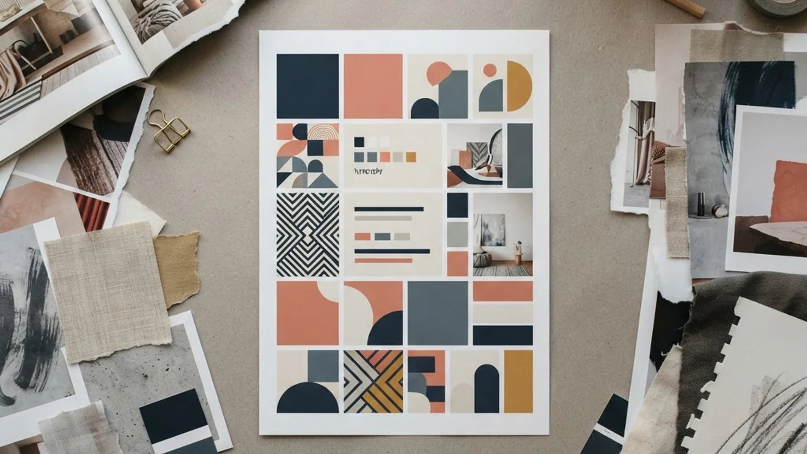
A mood board is a curated collection of visual references, typically images, color swatches, and font samples, arranged to convey an overall aesthetic direction. The core problem isn't the tool itself; it's how teams use it as a substitute for strategic thinking.
Mood boards show feeling, not function. A client can love a mood board full of moody photography and elegant serif type, then reject the actual logo concept because it doesn't work at a 16px favicon size, something a mood board never tests. Approval happens on emotion, and emotion doesn't translate directly into usable design decisions.
They also create a false sense of alignment. When a client says 'yes, this feels right' to a mood board, designers often assume the direction is locked. But taste expressed through curated references is different from taste expressed through actual layout decisions, and that gap surfaces later, usually after hours of design work have already gone in.
Mood boards rarely account for constraints. Brand guidelines, accessibility requirements, existing brand equity, and platform-specific limitations (like how a color renders on packaging versus a website) are almost never represented in a mood board, which means the 'approved direction' can be functionally impossible to execute well.
Practical Steps to Replace or Fix the Mood Board Process
Designers don't need to abandon visual references entirely, they need to restructure how those references are used. The following approach keeps the useful parts of mood boarding while removing the parts that cause misalignment.
- Start with a written creative brief. Define the audience, brand personality, functional requirements, and competitive context before any visuals are gathered. This anchors every image choice to a reason.
- Use style tiles instead of loose collages. A style tile pairs color, type, and texture in a structured layout that mimics how these elements will actually sit together in a real design, closer to a system than a scrapbook.
- Build a functional prototype early. Even a rough wireframe or mockup using the proposed direction reveals problems a mood board can't, like poor contrast ratios or type that doesn't scale.
- Get sign-off on specific applications, not general feelings. Ask clients to approve a sample business card, a homepage header, or packaging mockup, not just a collage of inspiration images.
- Document the 'why' behind every visual choice. If a color or typeface is chosen, note the reasoning tied to brand strategy so it can be defended later in the process, not just remembered as 'the one from the mood board.'
Mood Boards vs. Alternative Design Direction Tools
The table below compares mood boards against the tools many experienced design teams now use in their place, based on what each tool actually communicates and where it tends to fall short.
| Tool | What It Communicates | Main Weakness | Best Use Case |
|---|---|---|---|
| Mood Board | General aesthetic feeling | No functional or brand-strategy context | Early internal brainstorming only |
| Style Tile | Structured color, type, and texture pairing | Still lacks real layout context | Bridging inspiration and system design |
| Design Brief | Strategic goals, audience, constraints | Doesn't show visuals at all | Aligning stakeholders before visuals begin |
| Functional Prototype | Real layout, usability, and scale behavior | Takes more time to produce | Final direction approval |
What Experience in the Field Actually Shows
There's no large-scale published study measuring mood board approval rates against project revision cycles, so instead of forcing in a statistic that doesn't exist, it's more useful to describe what consistently shows up in agency workflows. In practice, design teams that skip straight from mood board to final concept report noticeably more rounds of client revisions than teams that insert a style-tile or prototype step in between. The pattern holds because mood boards approve a feeling, while clients ultimately react to and judge finished layouts, not curated inspiration.
Another consistent observation from working designers: clients rarely reject a mood board outright, even when it's the wrong direction, because there's little at stake in approving a collage. The real disagreement tends to surface once a logo, header, or packaging mockup is on the table, meaning the mood board step often just delays the actual decision-making conversation rather than resolving it. This is why pairing visual references with a written brief and at least one functional mockup, as outlined above, produces measurably smoother approval processes than relying on mood boards alone.
Key Takeaways
- Mood boards communicate aesthetic feeling but not functional or strategic context, which is where most client misalignment actually happens.
- Approving a mood board is not the same as approving a workable design direction; the gap surfaces later in revisions.
- Style tiles and functional prototypes give clients something closer to what they'll actually see and use.
- A written creative brief should precede any visual references so choices are tied to strategy, not just taste.
- Getting sign-off on a specific application (business card, homepage, packaging) is far more reliable than approving a general collage.
Frequently Asked Questions
Are mood boards completely useless in graphic design?
No, they're useful for early internal brainstorming and gathering references quickly. The problem is treating them as a final client approval step. Used as a starting conversation rather than a locked-in direction, they still have value in the design process.
What should replace a mood board for client approval?
A style tile combined with a functional mockup works better because it shows how colors, type, and layout actually behave together, rather than just how they look side by side as inspiration images.
Why do clients approve mood boards but reject the final design?
Because mood boards trigger an emotional 'I like this' response with little at stake, while the final design is judged against real usability, brand fit, and practical constraints the mood board never addressed.
How long should a design brief be before starting visual work?
It doesn't need to be long, one to two pages covering audience, brand personality, functional requirements, and competitive context is usually enough to anchor visual decisions in strategy rather than taste alone.
Can style tiles work for small projects with tight budgets?
Yes, a style tile takes roughly the same time to produce as a mood board but delivers far more usable direction, making it a reasonable swap even for smaller-budget projects.
Conclusion
The core issue with mood boards isn't the concept of gathering visual references, it's using them as a stand-in for strategic, functional design decisions. Teams that pair a written brief with a style tile and at least one working mockup consistently avoid the late-stage revision cycles that mood-board-only workflows tend to produce. For a deeper look at how visual references should connect back to actual brand strategy rather than just aesthetics, this breakdown of branding's core goal in design is a useful next read. The practical next step for any team relying on mood boards today is simple: keep them, but stop treating client approval of one as approval of the actual design direction.