Look at almost any website and you'll notice that the vast majority of it is text. Headlines, navigation, buttons, product descriptions, blog posts — the words are how visitors understand what you offer and decide whether to trust you. Yet typography, the craft of arranging that text, is one of the most overlooked elements in web design. Many sites obsess over images and color while treating fonts as a last-minute default.
That's a costly oversight. Typography influences whether people can comfortably read your content, how professional and trustworthy your brand appears, and even whether visitors take the action you want. This guide explains why typography matters so much in web design and gives you practical, usable principles for making type work harder for your site.
Table of Contents
- Typography is most of your design
- Readability and user experience
- Typography shapes brand perception
- Establishing hierarchy and guiding attention
- Typography and accessibility
- How type affects conversions
- Practical typography best practices
- Frequently asked questions
- Final thoughts
Typography Is Most of Your Design
It's often said that web design is around ninety-five percent typography, and while the exact figure is debatable, the spirit is accurate. Text dominates the web, so the way that text looks and behaves defines the overall experience more than almost anything else.
Because typography is so pervasive, small decisions have outsized effects. The font you choose, the size and spacing of your text, and the way lines and paragraphs are arranged all shape how effortless — or exhausting — your site feels to read. Get these right and the design feels polished and intentional; get them wrong and even a visually striking site feels amateur.
This is why serious website design treats typography as a foundational decision rather than a finishing touch. Type isn't decoration layered on top of content; it is how the content is delivered.
Readability and User Experience
The primary job of typography is to make reading effortless. If visitors have to strain to read your content — because the text is too small, the lines too long, the contrast too low, or the spacing too tight — they'll give up quickly, no matter how valuable your message is.
Good typography respects how people actually read on screens. Comfortable font sizes, generous line spacing, sensible line lengths, and clear contrast all reduce cognitive load and keep visitors engaged. Since most people skim rather than read every word, well-structured type also makes content easy to scan.
Poor readability directly hurts key metrics. Visitors leave faster, spend less time on the page, and absorb less of your message. Because engagement signals matter for both user satisfaction and search performance, readable typography quietly supports your broader goals, including those pursued through content writing and digital marketing.
Typography Shapes Brand Perception
Fonts have personalities, and visitors read those personalities instantly and often unconsciously. A clean, modern sans-serif communicates something very different from an elegant serif or a playful display face. Your type choices tell people whether you're serious or friendly, traditional or innovative, luxurious or accessible.
Consistency reinforces this impression. When the same carefully chosen fonts appear across your website, marketing, and materials, your brand feels cohesive and credible. Inconsistent or clashing type, by contrast, makes a brand feel disorganized and untrustworthy.
This is where typography intersects with broader graphic design. Type is a core element of brand identity, and thoughtful pairing of a distinctive heading font with a highly readable body font gives a brand both character and clarity.
Establishing Hierarchy and Guiding Attention
Typography is the primary tool for creating visual hierarchy — the system that tells visitors what's most important and in what order to read it. Through variations in size, weight, color, and spacing, type guides the eye from the main headline to subheadings to body text to calls-to-action.
A strong hierarchy makes a page instantly understandable. Visitors can grasp the structure at a glance, find what they need, and follow a logical path toward the action you want them to take. Without it, everything competes for attention and the page feels overwhelming and directionless.
This structure also helps machines. Proper use of headings communicates your content's organization to screen readers and search engines alike, which supports both accessibility and SEO. Good typographic hierarchy is thus as functional as it is aesthetic.
Typography and Accessibility
Typographic choices have a direct impact on accessibility. Text that's too small, too low in contrast, or set in overly decorative fonts can be difficult or impossible for many people to read, including those with low vision, dyslexia, or age-related sight changes.
Accessible typography uses adequate font sizes, strong contrast between text and background, clear and legible typefaces, and enough spacing between lines and letters. It also allows text to scale when users zoom, rather than breaking the layout. These practices align with the Web Content Accessibility Guidelines and benefit every visitor, not only those with disabilities.
Because accessible type is also clearer and more comfortable for the general audience, it's a rare case where doing the right thing and improving overall experience are one and the same. Building this into front-end web development from the start ensures your content reaches the widest possible audience.
How Type Affects Conversions
Typography doesn't just look nice — it influences behavior. Clear, readable, well-structured text makes it easier for visitors to understand your value and act on it, while confusing or hard-to-read type creates friction that quietly drives people away before they convert.
The typography of your calls-to-action is especially important. A button with clear, appropriately sized, high-contrast text invites clicks, while a cramped or ambiguous one gets ignored. The same applies to forms, pricing tables, and any element where clarity directly affects a decision.
Because typography shapes comprehension and trust, refining it is one of the most cost-effective ways to improve conversions. Small adjustments to size, spacing, and hierarchy can measurably lift how many visitors take the next step.
Practical Typography Best Practices
You don't need to be a type expert to apply solid typographic principles. A few reliable guidelines will improve almost any site.
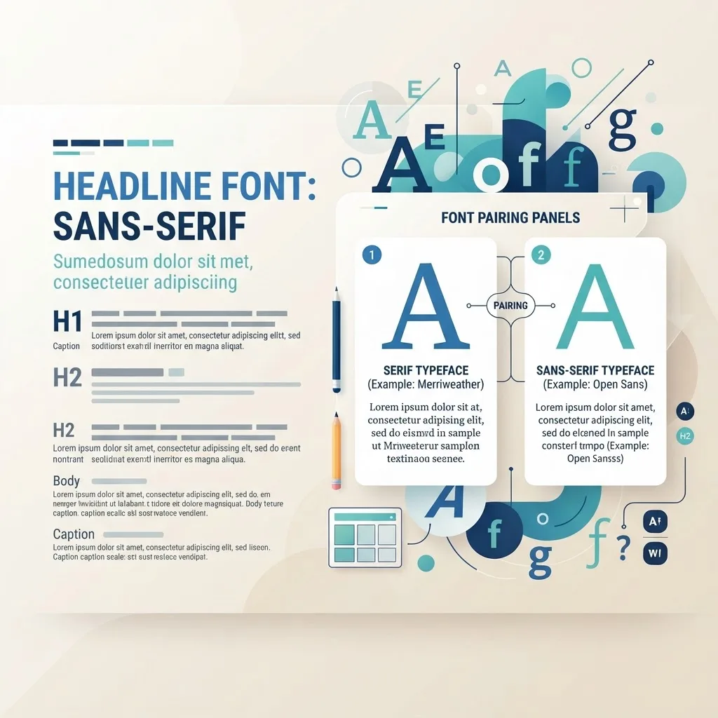
Limit your fonts. Two typefaces are usually plenty — one for headings and one for body text. Too many fonts create visual chaos and slow your site down.
Prioritize readable body text. Use a comfortable size, generous line height, and line lengths that aren't too wide, so paragraphs are easy to follow on any device.
Build a clear hierarchy. Use distinct, consistent styles for headings, subheadings, and body text so structure is obvious at a glance.
Ensure strong contrast and responsiveness. Text must be easy to read against its background and should scale gracefully across screen sizes, which is a core concern for both design and website maintenance and support over time.
Common Typography Mistakes That Undermine Good Design
Even attractive sites are often let down by a few recurring typographic errors. Knowing what to avoid is as valuable as knowing what to do.
Too many fonts. Mixing three, four, or more typefaces makes a page feel disjointed and slows load times. Discipline reads as confidence; a crowded font stack reads as indecision.
Body text that's too small or too light. Designers looking at large, high-resolution monitors often set text smaller and lighter than real visitors can comfortably read, especially on phones or for older audiences. When in doubt, err toward larger and higher-contrast.
Lines that are too long. Text that stretches the full width of a wide screen is genuinely tiring to read, because the eye loses its place jumping back to the next line. Constraining the measure to a comfortable width dramatically improves readability.
Insufficient spacing. Cramped line height and tight margins make paragraphs feel dense and intimidating. Generous spacing gives content room to breathe and invites people to keep reading.
Ignoring how type behaves responsively. Type that looks perfect on a desktop can break awkwardly on a phone if it isn't tested across screen sizes. Responsive typography is part of quality front-end web development and should never be an afterthought.
Decorative fonts for body copy. Display and script fonts can be striking in a headline but become exhausting or illegible in long passages. Reserve personality for headings and keep body text clean and readable.
Frequently Asked Questions
1. How many fonts should a website use? Two is a safe rule for most sites — one for headings and one for body text — with different weights for variety. Additional fonts rarely add value and can hurt performance and consistency.
2. What font size is best for body text? Body text generally reads well at a comfortable size that doesn't require squinting, typically around sixteen pixels or larger on the web. The exact size depends on the typeface, but readability should always come first.
3. Are serif or sans-serif fonts better for websites? Both work well; the choice depends on your brand and context. Sans-serif fonts are often used for body text on screens for their clean legibility, while serifs can convey tradition and elegance, especially in headings.
4. Does typography affect SEO? Indirectly but meaningfully. Readable, well-structured typography improves engagement and uses proper headings, both of which support user experience and help search engines understand your content.
5. What is typographic hierarchy? It's the use of size, weight, color, and spacing to signal the importance and order of content, guiding readers from headlines to body text to calls-to-action. Strong hierarchy makes pages easy to scan and understand.
6. Can bad typography really lose me customers? Yes. Hard-to-read text increases bounce rates and reduces conversions, and unprofessional type erodes trust. Typography directly affects whether visitors stay, understand, and act.
7. Should I use custom or system fonts? Custom fonts can strengthen your brand but must be optimized so they don't slow the site. System fonts load instantly and are a solid choice when performance is a priority. The right balance depends on your goals.
Final Thoughts
Typography is far more than an aesthetic choice — it's the vehicle for nearly everything you communicate online. It shapes whether visitors can comfortably read your content, how they perceive your brand, how easily they navigate your pages, and whether they ultimately take action. Treating type as a foundational design decision rather than an afterthought is one of the highest-leverage things you can do for your website.
By choosing readable, accessible, on-brand fonts and building a clear hierarchy, you make your content work harder and your brand feel more credible. If you'd like help crafting a site where every word is easy to read and every element earns its place, reach out to our team and let's design something that truly communicates.